Austin In-Home Fitness is an In-Home Personal Training Service. The company's philosophy is "Sustainable Fitness". Sustainable Fitness is teaching people how to create and maintain healthy exercise habits. With this in mind, I set out to create a logo that embodied this philosophy. We eventually arrived at the impossible triangle. This symbolism represents a never-ending commitment to fitness in the visual three-dimensional form that continues without an end. In addition, triangles (pyramids) are symbols of power and stability.
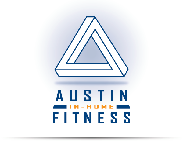
Final logo design.

This showcases the refined comps, ideas, and directions presented to the client. This was the basis of the project brief and getting to know Austin In-Home Fitness.
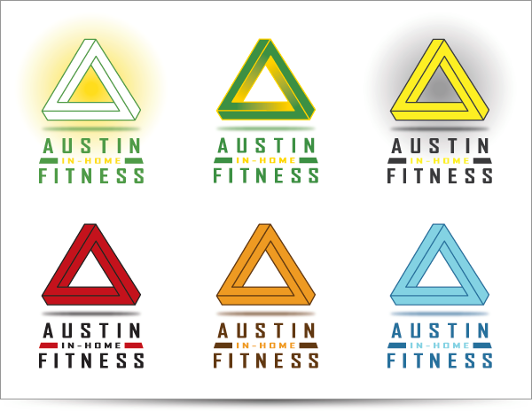
These are the color versions that we explored. The idea was hip and energetic with a sampling of retro sports colors.
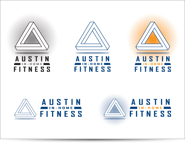
Final colors and all of the versions to cover any possible usages of the logo.
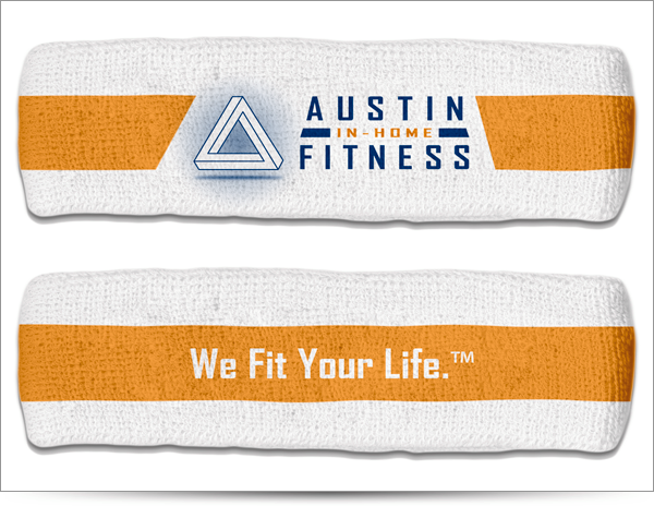
Headband with the logo on front and the company's "battle cry" (tagline) on the back.

Branding implemented on athletic, tube socks.
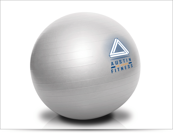
Branding implemented on an business related product, the exercise ball.