Seven Strand Properties needed branding and identity. The creative brief stated Seven Strand would develop and invest in properties for luxury senior living, multifamily, and general real estate. The majority of their clients would be coming from outside of Texas. Therefore, they wanted a logo and brand that conveyed a strong sense of Texas blended with high-end living. Their name, Seven Strand, is derived from a type of barbed wire. Seven Strand consists of seven wires braided to create the strongest of all barbed wire. This aligned with the philosophy of their business.
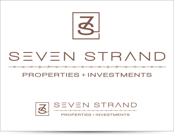
Final logo design.

The five comps we presented to the client. At an early stage, it's important to work in black and white. Once you nail down the elements, then you can move towards color choices. I presented each logo with a small and a reversed-out version. A good mark must read well at a small size and reversed-out.
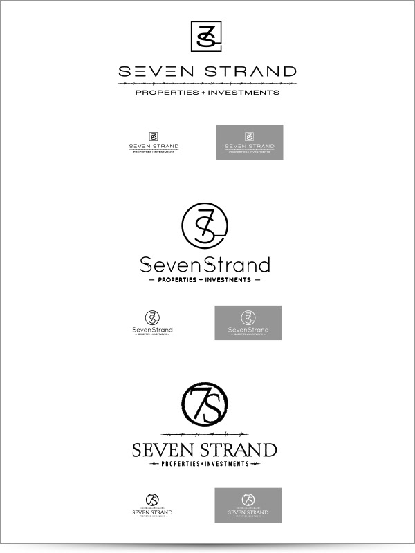
We narrowed down our choices to these three designs. The client liked the literal branding icons. The type treatment of the topmost design was their favorite and hit the high-end, luxury resort feel. Adding in the "7" and "S" branding elements sealed the deal.
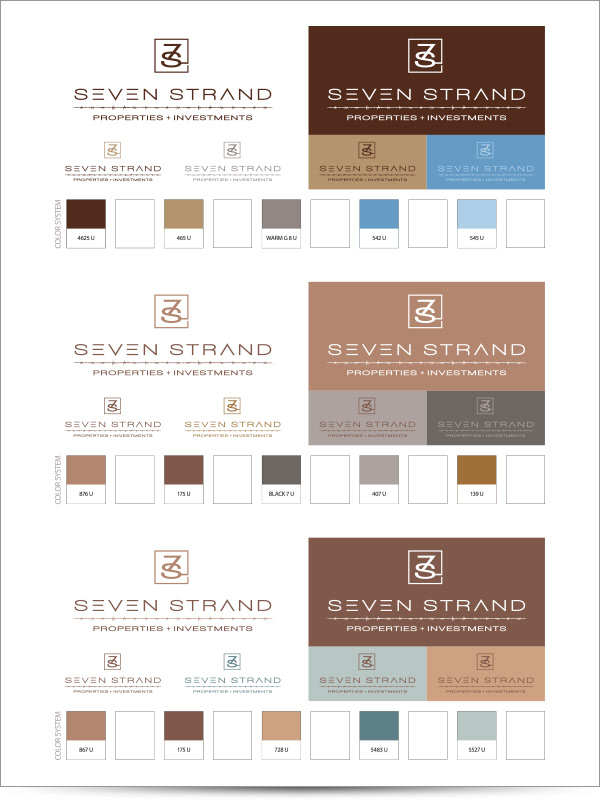
Color palette options. The vision for the color palette was desaturated earth tones that would mix well with natural building materials. Materials such as: wood, stone, and metal.
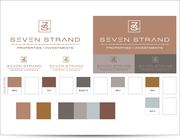
Final color palette. Complete with places to attach Pantone color swatches. This way the client could see the difference between the laser printer color and the actual Pantone color.